Card
Used to display content related to a single subject.
Nue Camp
This is the card body. Lorem ipsum dolor sit amet, consectetur adipiscing elit. Curabitur nec odio vel dui euismod fermentum. Curabitur nec odio vel dui euismod fermentum.
Usage
import { Card } from "@chakra-ui/react"<Card.Root>
<Card.Header />
<Card.Body />
<Card.Footer />
</Card.Root>Examples
Variants
Use the variant prop to change the visual style of the Card.
Nue Camp
This is the card body. Lorem ipsum dolor sit amet, consectetur adipiscing elit.
Nue Camp
This is the card body. Lorem ipsum dolor sit amet, consectetur adipiscing elit.
Nue Camp
This is the card body. Lorem ipsum dolor sit amet, consectetur adipiscing elit.
Within Form
Use the Card component within a form to group related fields together.
Sign up
Fill in the form below to create an account
Sizes
Use the size prop to change the size of the Card.
Card - sm
Card - md
Card - lg
With Image
Use the Card component to display an image.
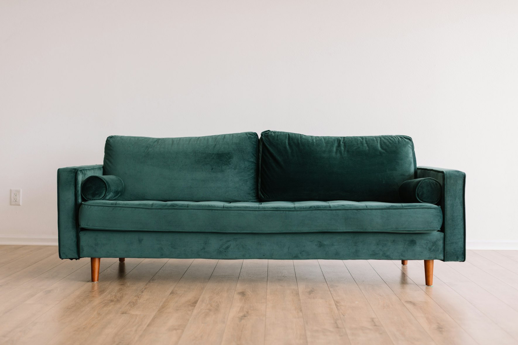
Living room Sofa
This sofa is perfect for modern tropical spaces, baroque inspired spaces.
$450
Horizontal
Use the Card component to display content horizontally.

The perfect latte
Caffè latte is a coffee beverage of Italian origin made with espresso and steamed milk.
With Avatar
Use the Card component to display an avatar.
 NF
NFNate Foss
@natefoss
Nate Foss has requested to join your team. You can approve or decline their request.
Customization
Adding new variants
Create a custom Card recipe to add new style variants:
theme.ts
import { defineSlotRecipe } from "@chakra-ui/react"
import { cardAnatomy } from "@chakra-ui/react/anatomy"

const customCardRecipe = defineSlotRecipe({
  className: "chakra-card",
  slots: cardAnatomy.keys(),
  variants: {
    // add new variant="ghost"
    variant: {
      gradient: {
        root: {
          bg: "linear-gradient(135deg, #667eea 0%, #764ba2 100%)",
          color: "white",
        },
      },
    },
  },
})
Adding new sizes
Add custom size variants to the Card recipe:
theme.ts
const customCardRecipe = defineSlotRecipe({
  // ...
  variants: {
    size: {
      // ... existing sizes (sm, md, lg)
      xl: {
        root: { "--card-padding": "spacing.10" },
        title: { textStyle: "2xl" },
      },
    },
  },
})
Changing defaults
Set new default values for size and variant:
theme.ts
const customCardRecipe = defineSlotRecipe({
  // ...
  defaultVariants: {
    variant: "elevated", // Default to elevated instead of outline
    size: "lg", // Default to lg instead of md
  },
})
Updating the theme
Add the custom recipe to your theme:
components/ui/provider.tsx
const config = defineConfig({
  theme: {
    slotRecipes: {
      card: customCardRecipe,
    },
  },
})

const system = createSystem(defaultConfig, config)

export function Provider(props: { children: React.ReactNode }) {
  return <ChakraProvider value={system}>{/* ... */}</ChakraProvider>
}
View the default Card recipe for reference.
Props
Root
| Prop | Default | Type |
|---|---|---|
size | 'md' | 'sm' | 'md' | 'lg'The size of the component |
variant | 'outline' | 'elevated' | 'outline' | 'subtle'The variant of the component |
as | React.ElementTypeThe underlying element to render. | |
asChild | booleanUse the provided child element as the default rendered element, combining their props and behavior. For more details, read our Composition guide. | |
unstyled | booleanWhether to remove the component's style. |
Explorer
Explore the Card component parts interactively. Click on parts in the sidebar
to highlight them in the preview.
Profile
Nue Camp
This is the card body. Lorem ipsum dolor sit amet, consectetur adipiscing elit. Curabitur nec odio vel dui euismod fermentum.
Component Anatomy
Hover to highlight, click to select parts
root
header
body
footer
title
description